---
title: Tags
description: Tags allow to add extra content to your tour. The content can literally be anything like an image or video, webpage, link to another space, music, etc and the way to activate this content is simply by clicking on the tag.
---
[Skip to content](https://info.treedis.com/help.center/tags-article#main-content)
English
Show submenu for translations
Open main navigation
Close main navigation
- English
Show submenu for translations
- [Go to treedis.com](https://www.treedis.com/)
[Go to treedis.com](https://www.treedis.com/)
This is a search field with an auto-suggest feature attached.
- There are no suggestions because the search field is empty.
1. [Help Center](https://info.treedis.com/help.center)
2. [3D Editor](https://info.treedis.com/help.center/3d-editor)
3. [Tags](https://info.treedis.com/help.center/3d-editor#tags)
# Tags
**Tags** are a powerful way to enrich your virtual tour with interactive content. From images and videos to webpages, audio, and links to another space, you can instantly unlock deeper insights simply by clicking on a tag.
With our newly improved layout, the Treedis tags design streamlines this entire workflow, making content creation more intuitive, user-friendly, and efficient than ever before.
### **Functionality**
#### **Configuring the Mattertags**
If you have created the tag in the Matterport system, it will automatically be embedded and displayed in the Treedis tour.

- **Matterport Tag Switcher** serves to show or hide the bar to navigate between Matterport tags within a Treedis tour. When enabled, this bar appears at the top-center of the screen inside the tour.

- **Matterport Dock** displays and unfolds tag information inside a dedicated sidebar on the left or the right side upon your preferences.
### **Treedis Tags: Settings**
The **TAI Tag** button opens the TAI Tag settings page, where you can set up automatic AI tagging for your space. *Available for Enterprise plans only.*

If you have tags created from a previous tour, you can click the three-dot menu **⋮** to export or import them via a JSON file.

The ***Search* *bar*** allows for easy and fast navigation to locate specific tags within the 3d editor.

To add a new tag, click the "**+ Add**" button and decide where to place it on the space.
 
**Tag type settings** let you define the layout style and hover effects for tags in the tour. Click the gear icon to define the tag's type and hover effects.
**Note:** The **Tag type** and **Action on hover** settings apply to all tags in the tour. Each tag’s appearance and content can still be customized individually. Saving your changes will reload the tour.

**Type Options:** choose between Treedis or Matterport styles. Switching an existing Mattertag to the Treedis layout will override its native styling and convert it into a Treedis tag.
 
**Actions on Hover:** define what happens when a user hovers over the tag. You can choose to display nothing, show a tag tooltip, or enable an *Expand* button that opens the tag in full-screen mode.
****
When creating a new tag, you will see several controls in the tag settings:
- **Eye icon** means that you have now opened the tag’s general settings.

- **Navigation icon** displays direction arrows to adjust the tag's physical position. If you start moving a tag but want to cancel the action, click the ***Eye Icon*** above to close the arrows.

Once a tag is placed, configure its identity text:
**Title** – Enable this toggle to display the tag's name when users click or hover over it. **Note:** The tag title is useful for distinguishing between tags and analyzing the statistics collected for each individual tag in Analytics.
**Description** – Add detailed text descriptions to the tag of up to 2,000 characters. You can fully format this text to match your styling needs.

### **Tag Action Types**
#### **Tag Media Content (Images / Videos / PDFs)**
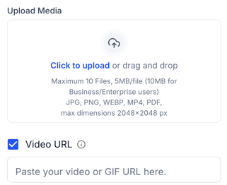
To create a Media tag with images and/or videos, upload the desired files to the tag. Supported file formats include JPG, PNG, WEBP, MP4, and PDF.
You can upload a single file or combine multiple files into a *gallery* of up to 10 items. The maximum file size is 10 MB per file (20 MB per file starting from the Business plan).
You can also add a video link (GIF, YouTube, or Vimeo) to display the video either as a standalone media item or as part of the tag gallery.
e.g. 
### **Actions on Click**
In addition to the media content, the tag Action Types allow you to select from a variety of actions that can be triggered when the tag is clicked:

#### **None**
**None action type** - no additional action is triggered when the tag is clicked. Users will only see the tag title, description, and any media content that has been added.

**Move to Tag Location** -keep this toggle enabled if you want users to be automatically transferred to the tag's location when they click it. If you disable this toggle, clicking the tag will no longer teleport users to its location.
#### **Popup**
**Popup action type** allows you to display the layout featuring **video + text** or **image + text** within the tag.
- Supported image formats: JPG, PNG, WEBP. The maximum resolution is 2048 pixels for both width and height.
- Video can be added as an MP4 file or via a YouTube or Vimeo URL.
e.g.
Click the **Settings** icon next to Popup to configure:
- **Layout** of the tag content (expand or custom)
- **Text alignment** (vertical or horizontal)
- **Color** for both, text and background. You can choose any background color and adjust its opacity, making the background as transparent as needed.
****
#### **Tour Link**
**Tour Link action type** redirects the visitors to the Matterport or Treedis tour. The system accepts both Treedis and Matterport URL.

If you want users to be redirected to the starting point of the space, then use a *public tour link*.
If you want users to be redirected to the tour location with coordinates, then use a *deep link* (to retrieve a deep link, click **CTRL+Y** inside the **Treedis tour;** click **U** inside the **Matterport tour**).
You can also decide on the movement type for the Matterport link: *instant* or *fly-over*.
Fly-over effect can be applied to move between the locations of the same Matterport space only.

#### **New Tab**
**New Tab action type** allows opening the website content in the new browser tab after clicking on the tag. Just put in the destination link, for example, https://www.treedis.com.
### ****
#### **Audio**
**Audio Player action type** allows uploading an audio MP3 file to the tag, 5 MB per file. After clicking on such a tag, it will display the player to pause the audio and/or mute it.
 e.g. 
#### **Panorama**
**Panorama** **action type** allows opening the panorama after clicking on the tag (make sure to previously enable/add the panorama to the Panorama section to be able select it from the list and assign to the tag).

#### **Menu**
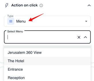
**Menu** **action type** allows to highlight the item in the Burger Menu after clicking on the tag. You will need to select which Burger Menu item to assign to the tag *(Important: currently the highlight effect is still under development).*
#### **iFrame**
**iFrame action type** opens the website content directly in the tour. However, not all websites allow to use their links. You can use a tester [https://iframetester.com/](https://iframetester.com/)to check whether the needed link is iframe compatible.

If the toggle **Continue Background Audio** is enabled, the iFrame popup will not interrupt the background music.
### **Tags Appearance and Keywords**
In the **Appearance** section you can fully customize your tags.
- You can pick the most suitable **icon for the tag** and choose any color you want. You can also upload your own *custom* icon to the tag. If the uploaded icon doesn't suit your needs, you can reset it to the default Treedis icon.
- Enable the toggle **White Circle**, if you want to put the tag icon into the circle.
- **Tag opacity** - to make the tag clearly visible or completely transparent.
- **Stem** - decide if the stem below the tag should be visible or not.
 
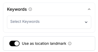
**Tag Keywords** – exist for navigation purposes within the tour's Navigation menu.
**Use as Location Landmark** – used for AR navigation. Marks the tag as a reference point for the "You Are Here" screen after localization. This option is best used for clear, permanent locations such as entrances, reception desks, or elevators.
### **Navigation Tags**
In the tag General settings, click the "+" icon to find more information about the navigation settings for the tags:
 
- **AR Path Settings** - activate, if you want to make the tag visible in AR mode.
- **Web Path Settings** - activate, if you want to make the navigation tag work in Web mode.
The Web Path settings offer a preview screen for easier configurations:

- **Display content** - to display the navigation bar for the tag.
- **Teleport button** - to show the button on the navigation bar that will automatically teleport a user to the tag.
- **Auto-move button** - to show the button on the navigation bar for automatic movement to the destination tag.
- **Autoplay** - to start moving a user automatically to the destination spot after clicking on the tag in the Burger Menu.
[Click here](https://info.treedis.com/help.center/navigation-tags) to find more information on how the Navigation Tags work.
### **How to Move Tags From One Tour to Another**
If you would like to transfer tags from one tour to another, you can use the **Export/Import** option.
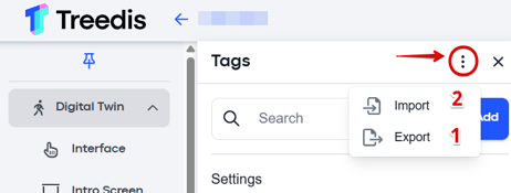
First, export the tags from the original tour **(1)**. Once the *JSON* file has been saved to your device, go to the other tour and import the file **(2)**.
**Note**: This feature works only when the tours are identical (duplicates) or have minimal differences in scanning. Tags will be imported into the 3D Editor and positioned in the tour. If the tours are not identical, you may need to manually adjust and reposition the tags after import.
### **How to Delete a Tag**
**Matterport Tags:** If your tags were originally created within the Matterport platform, they must be deleted directly on Matterport. Once removed there, changes may take up to **12 hours** to reflect in the Treedis tour.
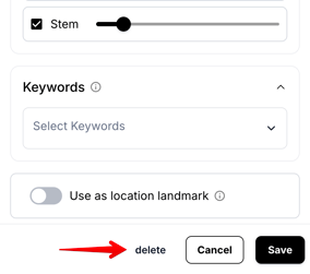
**Treedis Tags:** If the tags were created within Treedis, simply click on the specific tag to open its settings panel, where you will find the **Delete** button.
#### **Tags Bulk Deletion**
If you would like to delete all Treedis tags at once, rather than deleting them one by one, you can use the **Delete All Tags** option. This removes all tags from the current tour in a single action.

**Warning:** Bulk deletion cannot be undone, thus ensure you no longer need your existing tags before proceeding with this action.
---
If you have any questions or need assistance with the settings, please contact us at [support@treedis.com](mailto:support@treedis.com)
- [Workspace NEW](https://info.treedis.com/help.center/workspace-new)
- [3D Editor](https://info.treedis.com/help.center/3d-editor#main-content)
- [Interface](https://info.treedis.com/help.center/3d-editor#interface)
- [Intro Screen](https://info.treedis.com/help.center/3d-editor#intro-screen)
- [3D Scans](https://info.treedis.com/help.center/3d-editor#3d-scans)
- [Burger Menu](https://info.treedis.com/help.center/3d-editor#burger-menu)
- [Highlight Reel](https://info.treedis.com/help.center/3d-editor#highlight-reel)
- [Map](https://info.treedis.com/help.center/3d-editor#map)
- [Panorama](https://info.treedis.com/help.center/3d-editor#panorama)
- [Tags](https://info.treedis.com/help.center/3d-editor#tags)
- [Polygons](https://info.treedis.com/help.center/3d-editor#polygons)
- [Measurements Feature](https://info.treedis.com/help.center/3d-editor#measurements-feature)
- [Media / Vimeo / Green Screen](https://info.treedis.com/help.center/3d-editor#media-vimeo-green-screen)
- [Giphy / Sketchfab](https://info.treedis.com/help.center/3d-editor#giphy-sketchfab)
- [Virtual Staging / Avatars](https://info.treedis.com/help.center/3d-editor#virtual-staging-avatars)
- [FAQ](https://info.treedis.com/help.center/faq)
- [Manage](https://info.treedis.com/help.center/manage)
- [IoT Integrations](https://info.treedis.com/help.center/iot-integrations)
- [Analytics](https://info.treedis.com/help.center/analytics)
- [Treedis AI](https://info.treedis.com/help.center/treedis-ai)
- [Work Requests (Notes)](https://info.treedis.com/help.center/work-requests-notes)
- [White Label](https://info.treedis.com/help.center/white-label)
- [Flows](https://info.treedis.com/help.center/flows)
- [Navigation](https://info.treedis.com/help.center/navigation)
- [Experience Creator \*](https://info.treedis.com/help.center/experience-creator)
- [VR (Virtual Reality)](https://info.treedis.com/help.center/vr-virtual-reality)
- [AR (Augmented Reality)](https://info.treedis.com/help.center/ar-augmented-reality)
- [HUB \*](https://info.treedis.com/help.center/hub)
- [Billing & Subscription](https://info.treedis.com/help.center/billing-subscription)
- [V-Commerce](https://info.treedis.com/help.center/v-commerce)
[%20(1).png?width=16&height=24&name=Group%2039638%20(1)%20(1).png "Chill listening crop-3")](https://www.treedis.com)
treedis.com Help Center
Copyright © 2025, treedis.com